Audio-Video Call Mixup
Watch video summary, or search for audio on your podcast app under, Gregory Schmidt
Ever wonder why your phone sometimes makes a Facetime video call, when you thought you selected Facetime audio? Or other times, you receive a video call, only for it to hang up and have the person redial with audio?
It's not your fault. It's the user interface.
Let’s look at three ways to improve the interface to prevent this from happening.
1. Overlapping Tappable Areas
Each major mobile platform provides a user interface manual. This helps developers understand the user interface requirements for that platform. Apple calls theirs the iOS Human Interface Guidelines.
Apple asks that the “minimal tappable area” be 44pt x 44pt for all controls.
A tappable area smaller than this places users at risk for pressing the wrong button.
Even if the visible button does not fill all 44pt, the active area is at least 44pt wide. We are often imprecise when selecting buttons, but this does not matter - because of the 44pt buffer.
iOS Human Interface Guidelines: Layout
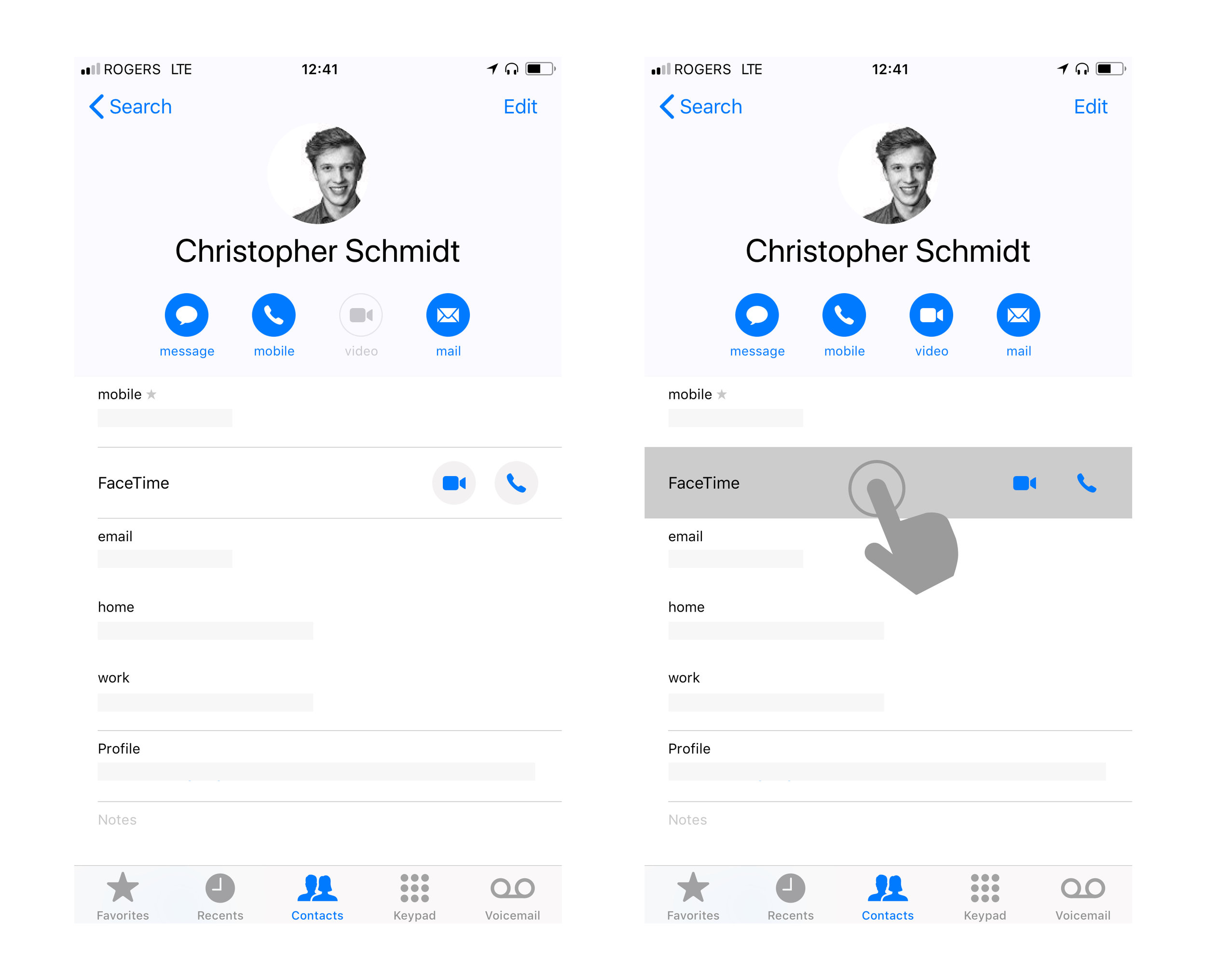
The problem, is that in the iOS Contacts App & iOS Phone App there are overlapping tappable areas.
If you depress anywhere on the Facetime video/audio row it activates that row - and launches a Facetime Video call.
This means, that when you select the Facetime Audio button - if you do not press exactly inside the visible boundary of that button, it activates the surrounding video call area.
The FaceTime audio button does not follow the minimal tappable area guideline, and is in fact enveloped within a FaceTime video field. This is where the problem lies.
The solution is straightforward. Either create a tappable area/ buffer around the FaceTime Audio button to prevent accidentally activating FaceTime Video. Or deactivate the ability to launch video from pressing the FaceTime row entirely.
2. Variation of placement of video & audio buttons
Reversal within same application
In iOS the Video & Audio button's placement is reversed even within the same application. Below we see a screenshot from the Phone App (and the same is seen in the Contacts App).
Reversal of Video & Audio placement within the same application
Reversal between applications
In most applications it seems the video button is on the left, and the audio button is on the right. If you pressed the far right button in Facebook, it would activate video, not audio like most other apps.
There is lots of horizontal space in the rows where the video and audio buttons site. In all apps the video and audio buttons could be moved further appart so they are not accidentally pressed. In particular in Facebook Messenger which has the shortest distance between the buttons.
It would also be helpful if Skype Mobile app made their phone icon look more like a phone (as it is in their Desktop App).
An Aside
Not directly related, but there is some inconsistency within FaceTime's application using both a video/audio toggle button at the top of the application, and switching to separate video and audio icons as seen elsewhere on the platform.
As the video/audio toggle is not used elsewhere, people may forget to realize the app is set to 'Audio' when they launch a call, or similarly that it is set to 'video. Having this option available complicates the screens. It would be better more straight forward to see all incoming/outgoing calls (video or audio) in one feed. The feed could retain the style used elsewhere using dedicated video & audio buttons in each row.
To add to the inconsistency, in the FaceTime mobile app although the row looks the same as the Contacts App - pressing anywhere on the row takes the user to the contact's profile and does not launch FaceTime video.


