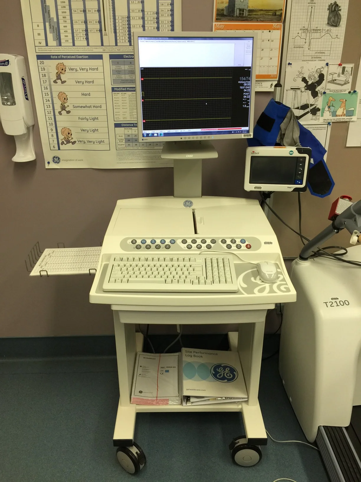
GE Cardiac Stress Test Machine Design Teardown
GE Healthcare - Cardiac Assessment System for Exercise Testing
Consistency in layout is essential.[1]
Medical devices frequently lack consistency throughout their design.
Lets look at GE Healthcare's CASE - Cardiac Assessment System for Exercise Testing. It is a market leader for in 'cardiac stress tests'. Unfortunately the console lacks consistency and uses multiple layout styles.
Not Centered
variable white space around buttons
multiple line heights
multiple horizontal alignments
multiple vertical alignments
lowercase, capital, and capitalization
Notes
[1] Instagram released a big update to their app this week, and I was surprised with the lack of consistency throughout. Bryan Mamril has written an exceptional article summarizing the issue.


