Uber App - Redesign
I have spent the last year in anti-Uber territories, but last month had opportunity to use the Uber again.
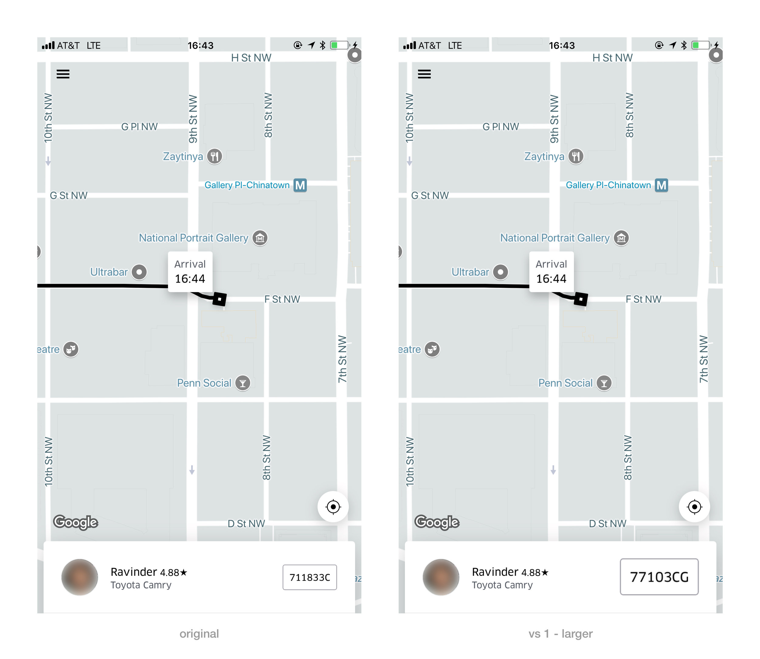
The main screen as you wait for your ride has a glaring problem - the licence plate is way too small.
Note: This is a fake driver profile, hashed together from components of other profiles.
What information is key?
This screen tells you two key pieces of information:
1. When your ride is coming. This is easy to tell. As the car gets closer to the pin, the black line between the car and pin shrinks.
2. What car to get inside. The "car type" is helpful to only a small extent, almost every Uber is a Toyota Prius. At airports or busy streets, you need the licence plate number to correctly identify which Uber to get inside. This means the licence plate is the absolute most crucial piece of information.
Unfortunately, this crucial piece of information is small. The font size may be fine for reading news articles on your phone or the app details in the back of an Uber. But it is too small to read as you hold your phone in front of you rushing onto the street from the roadside. (Plus, I can guarantee my mom can't read this without her glasses.)
Uber App Main Screen Redesign
Solution: make the licence plate info larger. There is plenty of space in the existing design to do this.
Step 1 - make text bigger
The first option includes enlarging the plate number & its rectangle. This option is nice as it retains the 'licence plate' appearance.
But if communication is the primary goal, the text could be larger...
Step 2 - make text even bigger
Bigger text. Easier to read. Accomplishing the 'purpose' of this screen in the app better.
The rectangle had to go, no space.
Step 3 - align to the grids
You will notice the enlarged licence (vs 1) plate and text (vs 2) fits within the margins set by the rest of the interface.
Step 4 - adjust to sight
Though it may mathematically be aligned, the licence plate itself is a more dense square object (right), whereas the driver's profile picture (left) is a circle and the centre of its weight is further away from the objects edge. This means that when the dense rectangle is placed perfectly aligned it 'appears' too far to the right.
I think it looks better to move the licence plate in a few pixels left away from edge to give the illusion of better balance.
Step 5 - Group numbers
The eye likes to view information in small clumps rather than strings. (This is why speed reading software clumps words into short phrases, and removes text from sentence structure).
Adding a gap in the digit string makes it easier to digest. Ideally the spacing on the app would mirror where the licence plates in that state/province places the space.
I also added slightly more space between all licence plate characters overall to improve legibility. (Admittedly, one typically brings characters together as the text size grows to improve legibility, but in this case the text is a heavier weight and was slightly too close together to start with).
Other suggestions
There is a lot of 'useless space' occupied by the map. Use it to double the amount of space occupied by the 'information' (driver's profile picture, name, car type, rating, licence plate, and arrival time) so the text can be enlarged.
Rebuttal: I'm sure someone will point out that you can enlarge the text if you make your phone's print larger. (Is this true? I haven't tried it with the app). Even if it is, the licence plate is too small.
Disclosure: This is a fake profile, with fake licence plate created from multiple drivers hashed data.
Uber App Version: October 2017. Screenshots from iPhone 7 Plus.


